You have no items in your shopping cart.
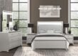
Decorating your home with colors is not only great fun, but it can influence your mood and make the overall design look completely different. The brief guide on the advantages and the pivotal functions of each color scheme will help you choose the color of the new furniture set or the paint for your walls. Select the best with the FurnitureCart!
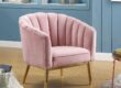
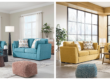
Tenderness of Pink
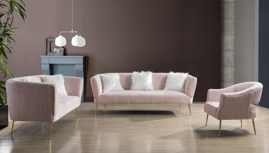
The pink color is tender, livable, and sophisticated. For a little princess think about confectionary pinks, reminding of cotton candies and bubble gums. To suit grown-up tastes, it is better to look into the pinks found in nature, like spring flowers in bloom or the sunset pink. Do you want to try anything new? Try to use more of coral pink, and dilute it gently with the orange pieces and accessories.
Vibrant Green
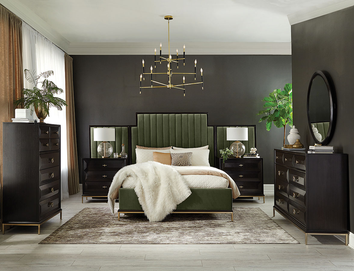
Greens are energetic. Nature touch and freshness are guaranteed by the green hues. Furthermore, emeralds are a high trend now, moss tone is gorgeous. Family homes with green hues correlate with the kids’ vibrancy. If you want it fresh and natural – pair it with white and brown, if bright – deep pinks and blues, or just go into a vivid and lush green.
Calming Blue
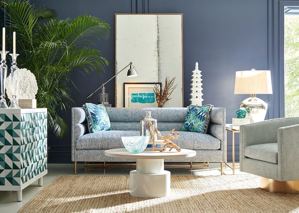
Blue shades reflect an easy, calm, and comfortable lifestyle. White-blue dyad tunes the beachy vibe, and it is a relief for the warmer climate. Blue-grey shades are a beloved trend for many years as it brings due to style and comfort. If space needs some warmth but you love blue, add some honey finishes, warm red or orange, earth tones to accompany blue.
Yellow Sunshine
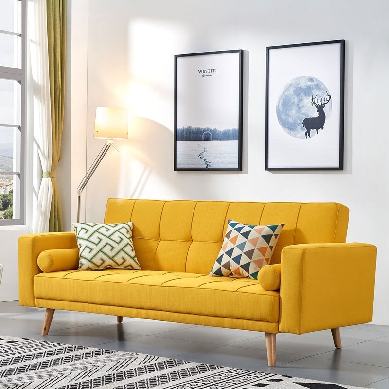
Yellow tones boost mood and make the atmosphere around joyous and youthful. What is more, yellow is a color that works best in a team with other colors. It works as an accent and the color splash in a dull neutral room. If you are still up to the total renovation of the interior, take yellow with creamy shade for the walls or choose the paint that has a chalky finish.
Daring Red
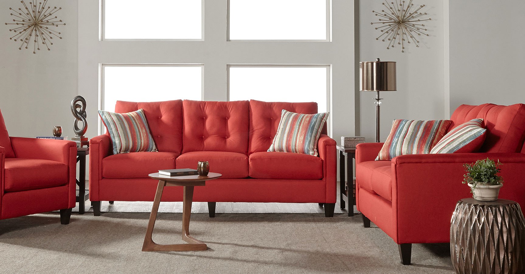
Reds are for the fearless persons. But stylish and elegant decor comes with daring red hues. If you have made a decision to go with red, then all the other pieces shall have the same level of intensity. Strict and sophisticated dyads include white, black, grey, that match flawlessly with red. Play with the palette of reds – don’t go at once into the plain red, look into lighter, deeper, and brownish. The last two will look more sophisticated in a room.
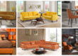
Energetic Orange
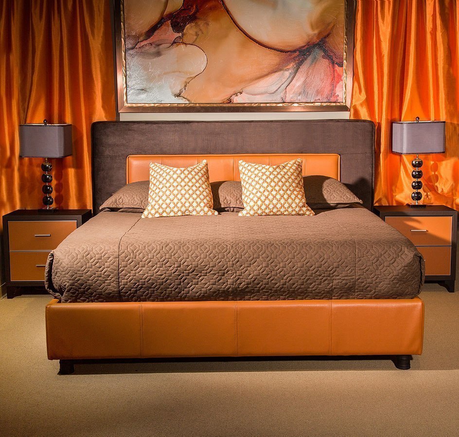
The oranges create a mood in your room, bring energy, and warm any space. If lemon hues are bringing happiness, warm orange ones are welcoming and boosting mood. For traditional and ‘noble’ rooms brownish-orange is preferable. The cozy atmosphere in the rooms is gained by pairing vivid orange with earthy tones and deep brown furniture. A soft peach/orange is also an option for a feminine bedroom.
Royal Purple
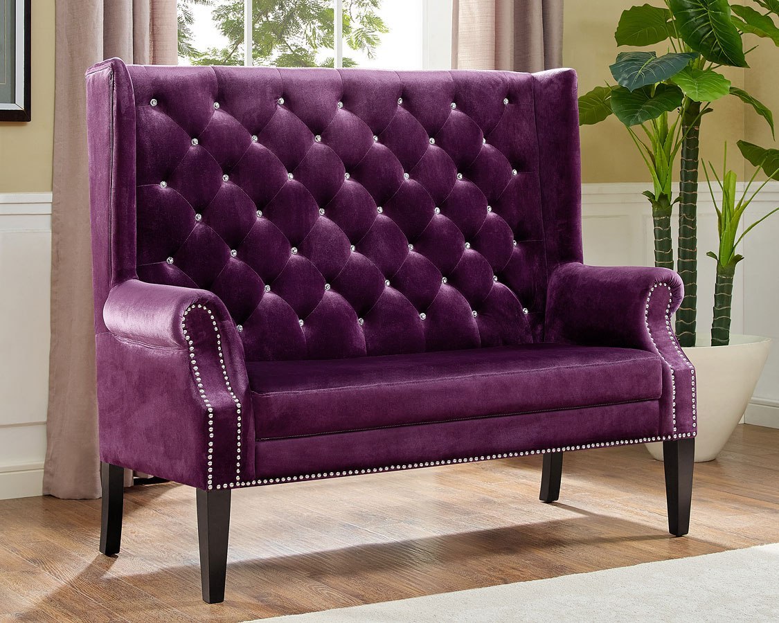
Purple is a royal tone, so let’s bring it back the due honor. Mostly considered to be used for the bedroom of a young princess, it is the color that can easily gain the spot in every room of the house, from a major bedroom to living room. From delicate and tender lavender to rich royal purple it has a soothing effect, making any room cozy. Play with patterns, purple tone spectrum, and texture in any of the other rooms to make house tune right.
Summary
Article Name
Let The Bright Colors In!
Description
Let The Bright Colors In!
Author
Julie